About
‚óè Friends
‚óè Assignment
‚óè Chat
‚óè Post
Sunday 20 January 2013
WD2 — Beautiful website analysis #2 @ 16:07
-This is The Butterfly Farm website
- For the background, it using very simple white stroke and yellow as background
- For the header, it show different type of butterfly and the grow of butterfly illustrator. Let user gain more interesting with butterfly.
- The footer show the copyright issue and above footer have their quote slide.
- The purpose of this website is want to let more people have more interest and more understand about butterfly.
Tuesday 15 January 2013
@ 01:18
Dream in the sky
- The needle represent rain.
-The wood represent the town (building)
Memory
Sunday 13 January 2013
WD2 — Moodboard @ 18:17
WD2 — Site Map @ 10:53
Competitor website analysis @ 10:16
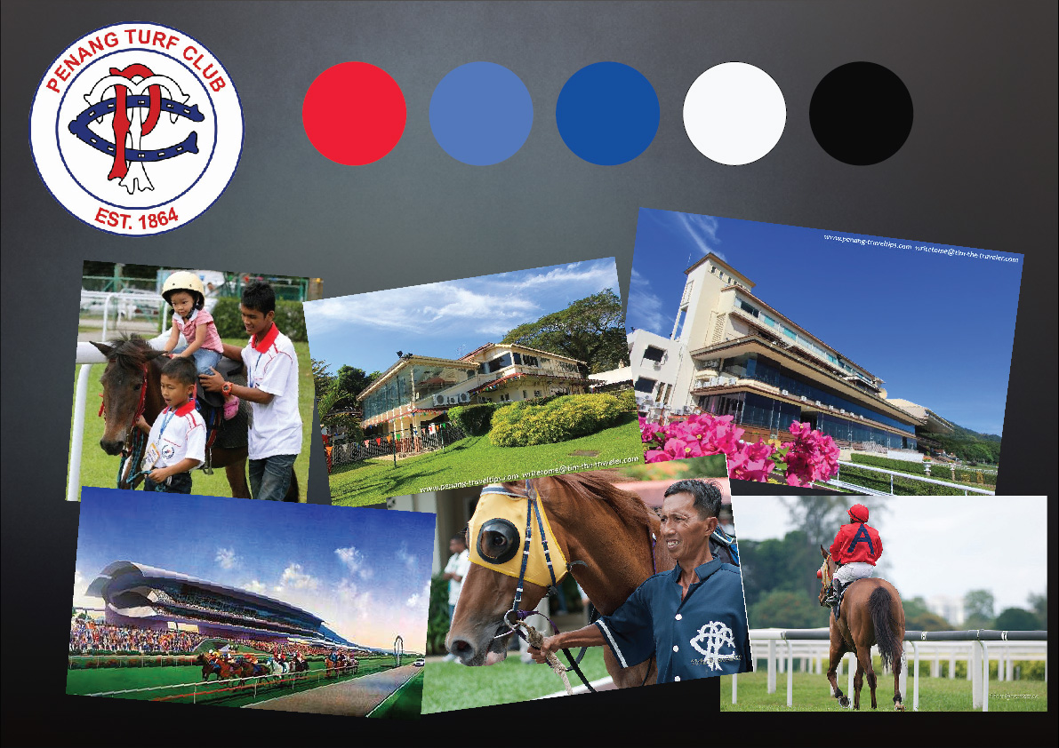
- This is Penang turf club website.
- The overall layout look messy and confuse. For the quick link that show at
home page by using picture is look like banner and very hard difference which
category by using picture.
- Maybe can add site map at the footer can let user more understand the flow.
Through the 1st page, user also very hard to get the latest news from the turf club.
The photo slide show is a bit too fast. Maybe can make it longer, so that user can
see clear and get the message.
-This is Gold coast turf club website
-The overall mood is feel much different that others. It din’t show very square
and the layout is different.
-The navigation management is quite well, they place the main or more important navigation
at the top and category let user more easy to get what they want to go.
-Beside that, it also have site map at bottom part of the website,
let user more understand the flow of the website.
-The banner at the home page is big and attractive enough, can let user know
the latest news immediately.
- This is Selangor Turf Club website.
- The main colour mode that using are choosing from the logo (Selangor flag colour mode).
The information is quite complete and the overall layout can be better.
The right site feel a bit heavy.
- The photo gallery is not very user friendly.
- This is Singapora turf club website
- For the background, it just using a simplest gradient.
- The overall look very clean and professional. The overall main colour
is choosing from the their logo colour.
- The layout is very smart, it create a faster way let user can easy understand and the
latest news at the same time. At the footer, it show more connected link and some quick link.
The layout manage is very well done! :D
Monday 7 January 2013
WD2 — Gantt Chart #1 @ 18:49
WD2 – Beautiful website analysis #1 @ 18:30
-This is Banger’s website
- For the background, it using old feel picture to show vintage feel
- For the text,
navigation — MochaMattari font with 20px.
When mouse over it change to red colour to let user to know what they looking at.
content tile — MochaMattari font with 19px and 24px,
sub navigation — MochaMattari font with 28px,
content — Droid Sans font with 16px.
For the text, is very hard to read. But the overall grid is not bad.
- For the header, it always show and maintain at the top site, if u scroll, it maintain visible at the top.
- It show logo at the left site and some main navigation.
- For the illustration, it is big and clear enough.
-This is Elaine Fisher website
- It using texture with some montage to do as background
- For the text,
navigation — Georgia font with 12px, Bold.
tagline, — Museo Slab font with 39px, Bold
Sub navigation — Museo Slab font with 16, weight:300
and the content — Ff Meta Serif Web Pro font with 13px.
For the naming, — Ff Meta Serif Web Pro font with 14px, bold.
- For the header, It show the website name at the center, and some main navigation
- For the footer it show some contact navigation and some copyright and policy and site map navigation,
make it more user friendly. The site map is very clear and easy understand.
- For the illustration, it is big and clear enough and different page have difference illustration.
At the Home page, the illustration change automatic in every 5sec.
- The overall mode feel intimacy and home casual sense.
-This is loysel’s Toy- The coffee crafters website
- For the background, it using very simple texture paper
- For the header, it show a cookie logo at left site and the navigation and copyright are align left.
- For the illustration, it is big and clear enough and it using sketches art style.
- The overall is very simple but the art style it use are unique.
It only using light brown, black and red colour for this website.
- This is przeznaczenie—strona glowa website
- For the background, it using texture with montage related image and element.
- For the text,
navigation — Arial font with 17px, Bold.
content — Verdana font with 12px,
Sub Navigation — Arial Narrow font with 17px, Bold.
- For the header, it show a cover illustration at the main navigation at the top
- For the illustration, is easy to understand and it crop very nice.
- The overall mode is strong and interesting.
The flow and the grid are managed very well and easy to understand the flow.