- This website is about food website.
- Overall look vintage style by using beige color. Right side with a desert picture(crop) and left side with a simple picture as texture(overlay).
- For the header, it show a character as logo with title and subtitle.
-Inside the home page, it show a slide show of the product(food), can reduce user feel boring if every time look at the same picture.
- For the footer it show the copyright and the powered by
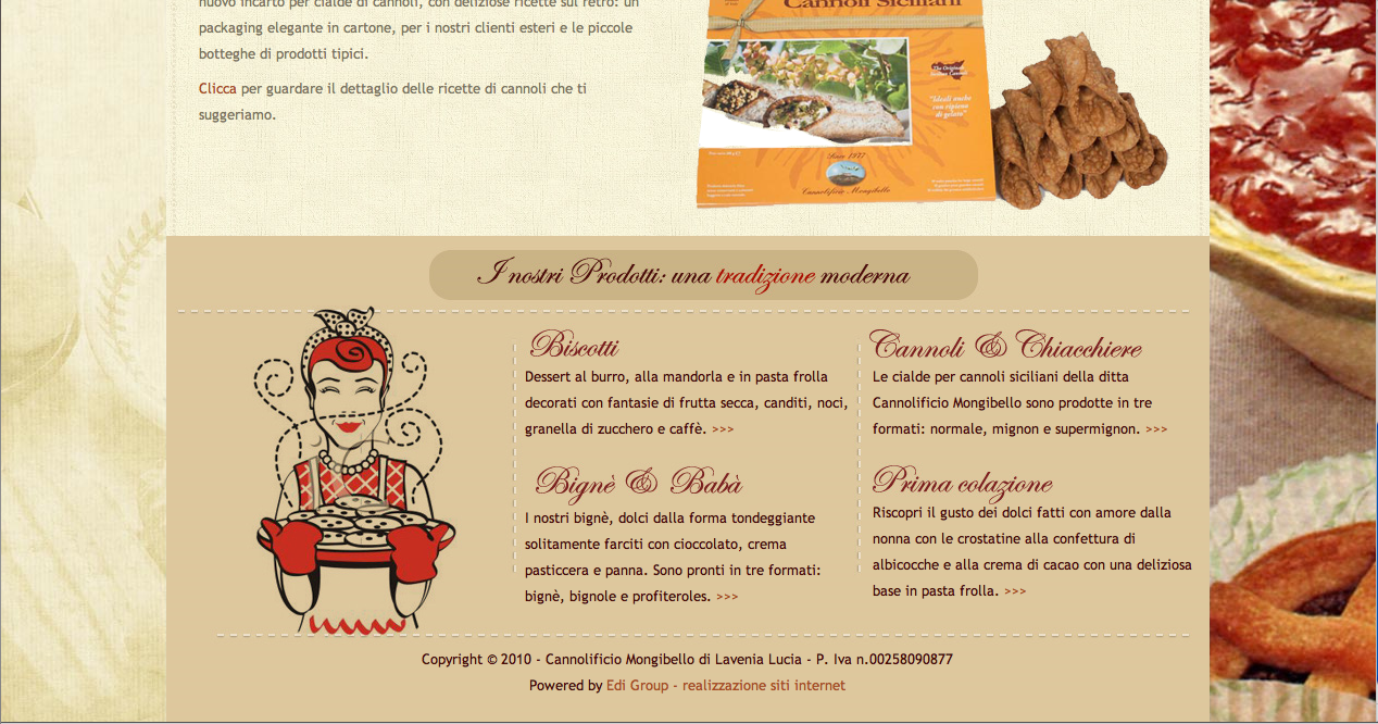
- For the illustration, it is big and clear enough to show audience the quality and the delicious of the food. It look really delicious.
- Overall it look high class and the color it use black color as background and white color with the font and logo.
- The composition is simple but look very neat and clean.Let user easy to focus where they wan to search for.
- The navigation is simple without extra design, but bring out the overall mood. At the header use icon show where is the location that user looking for.
- For the text of navigation, it is CDLXMonoRegular with 14px, Bold and normal style. For every image title is using courier with 12px, Bold and content using Georgia with 12px.
- For the illustration, it’s big and clear enough with suitable size.
- For the background, it using a wood image as background.
- For the text, it is Helvetica and using different weight to show the hierarchic.
- For the navigation, it using typo with different type family and type size. When I mouse over the word I only known that, that is a navigation/ button.
- For the header, it show logo and some basic and common info (open daily and from 10am to 11pm.
- For the illustration, it is big and clear enough and using a slide show to let user look through all the picture. Can prevent user feel boring and can let user stay longer bit at the page.
- For the background, it show a vertical line wallpaper, bottom part with some pattern wall paper. Color: brown
- For the navigation, it is TommasoRegular with 26px, normal weight and style. - Title of the text (welcome to gianni’s steakhouse) font: TommasoRegular; size:40px
content font: Adobe Garamond Pro; size:16px
- For the header, it show big enough slide show illustration with the food name and with a basic info - day and time.
about
Nice to meet you! :D
Hi~ My name is Stany.
This blog just for education purpose.Hope you like it ;)
Hey~ if you feel my artwork is great or bad, feel free to comment :)
about
Nice to meet you! :D
Hi~ My name is Stany.
This blog just for education purpose.Hope you like it ;)
Hey~ if you feel my artwork is great or bad, feel free to comment :)